
Sales Pipeline Report
Making complex information and data more intuitive and accessible through visualization.
Team
Developers
Project Manager
Tool
Figma
Tımelıne
9 Weeks
My Contribution
Responsible for structuring information, selecting appropriate charts, and conducting user research on color accessibility for Sales Pipeline Reports, ultimately delivering an optimized UI.
Final Metrics


The Problem Space
Most Sales Pipeline Reports are cluttered and lack intuitive data visualization, making it difficult for users to quickly grasp key insights.
Our Solution
Using charts for data visualization, optimizing colors, and ensuring accessibility.
How Did I Achieve This?
Overview
MixCommerce is a CRM platform. We designed the Sales Pipeline Report to help sales teams track deals and optimize strategies. However, many CRM reports are cluttered and poorly designed, making key data hard to find. So, we aimed to enhance readability and usability through better UI design and data visualization.
How do other CRM platforms present sales reports?
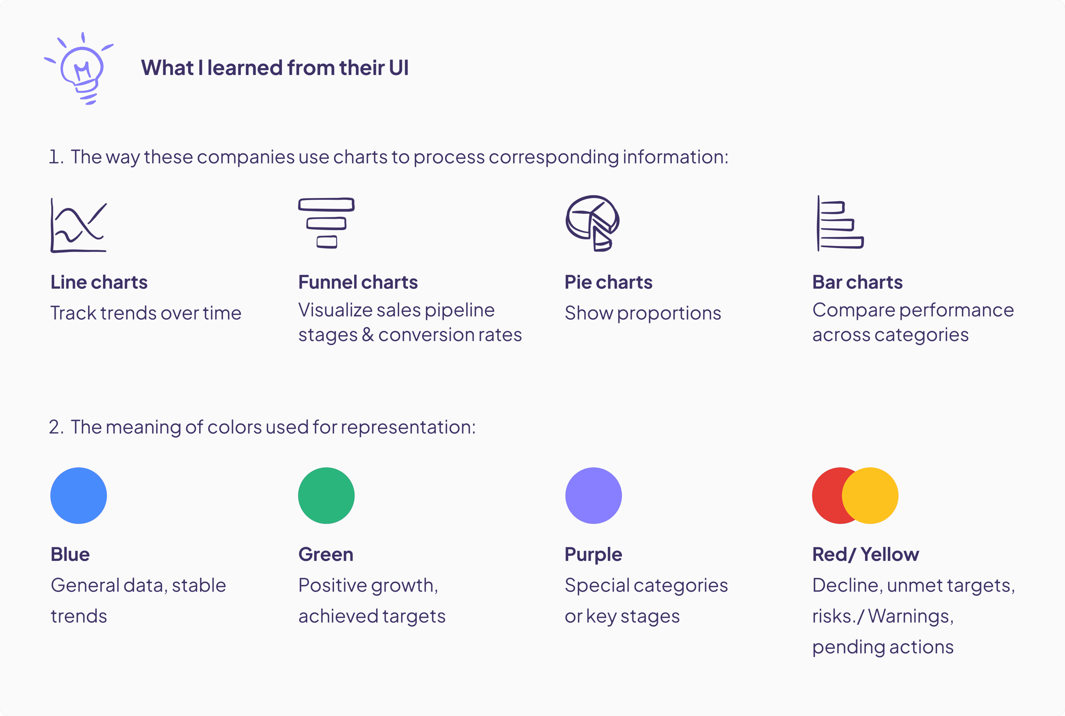
We analyzed how HubSpot, Salesforce, Pipedrive, and Zoho structure their Sales Pipeline Reports, including the data they present, the charts and colors they use, and their strengths and weaknesses.
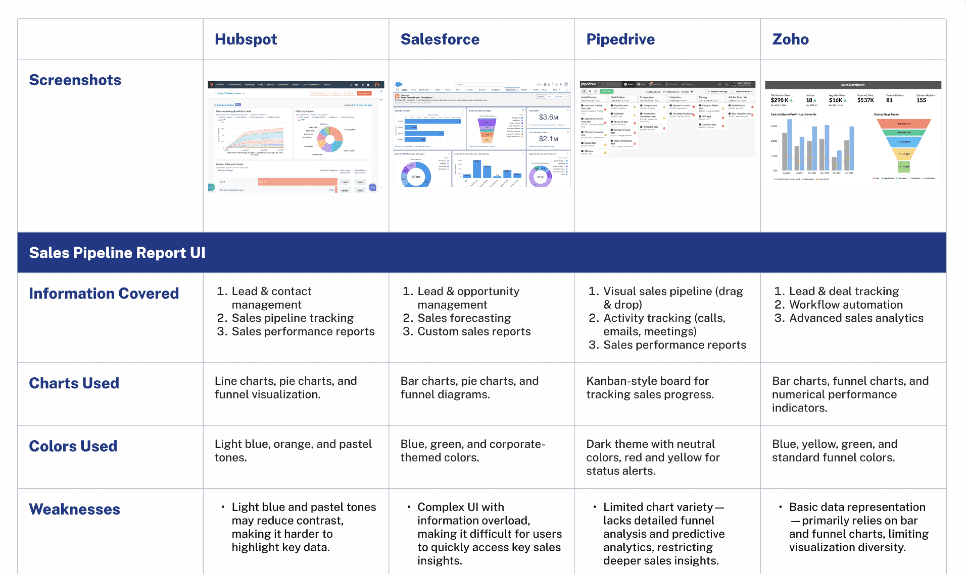
However:
Although they have considered different chart types and the representational meaning of colors, some platforms still suffer from complex interfaces, information overload, and poorly considered color choices.
HMW:
enable users to instantly capture key information through a large amount of data?
Defined requirements, structured information
I first outlined the architecture based on company requirements, then assigned potential chart types to each section.

Wireframe & Improvement
After aligning requirements with the PM, I created wireframes and iterated based on feedback.
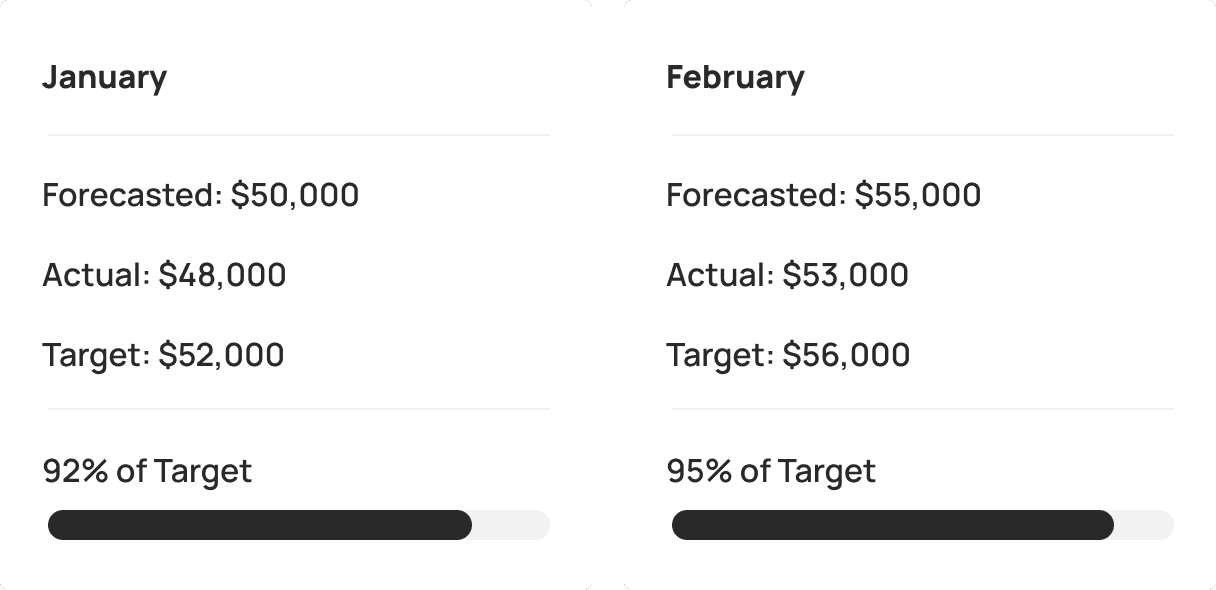
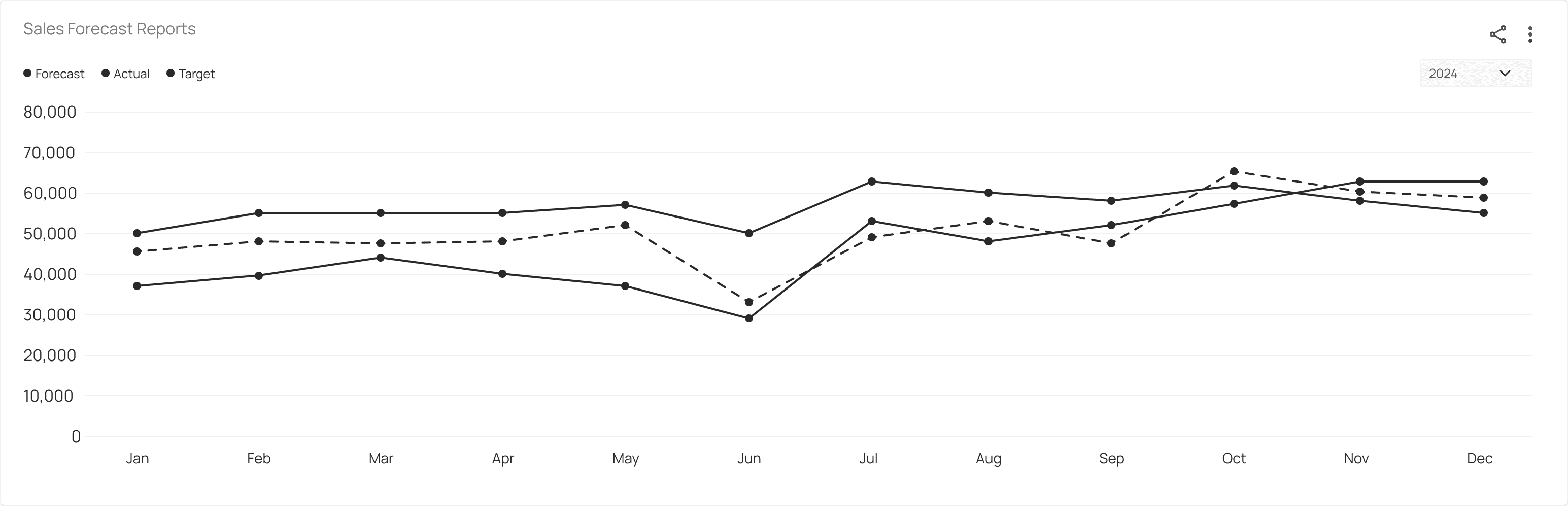
Sales Forecast
Before
Used a combination of cards and bar charts to display monthly sales forecasts.
After
Used a line chart to show potential sales forecast fluctuations over a year.
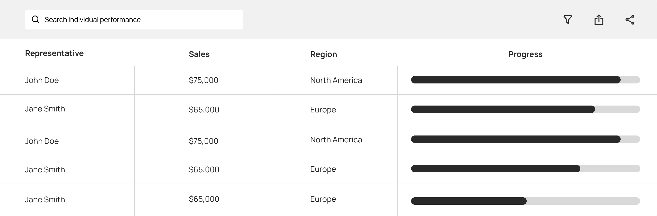
Individual Performance
Before
Used tables and bar charts to display each sales rep’s performance and task progress.
After
Added sales reps' avatars, regional flags, and progress percentages for better clarity and emphasis.

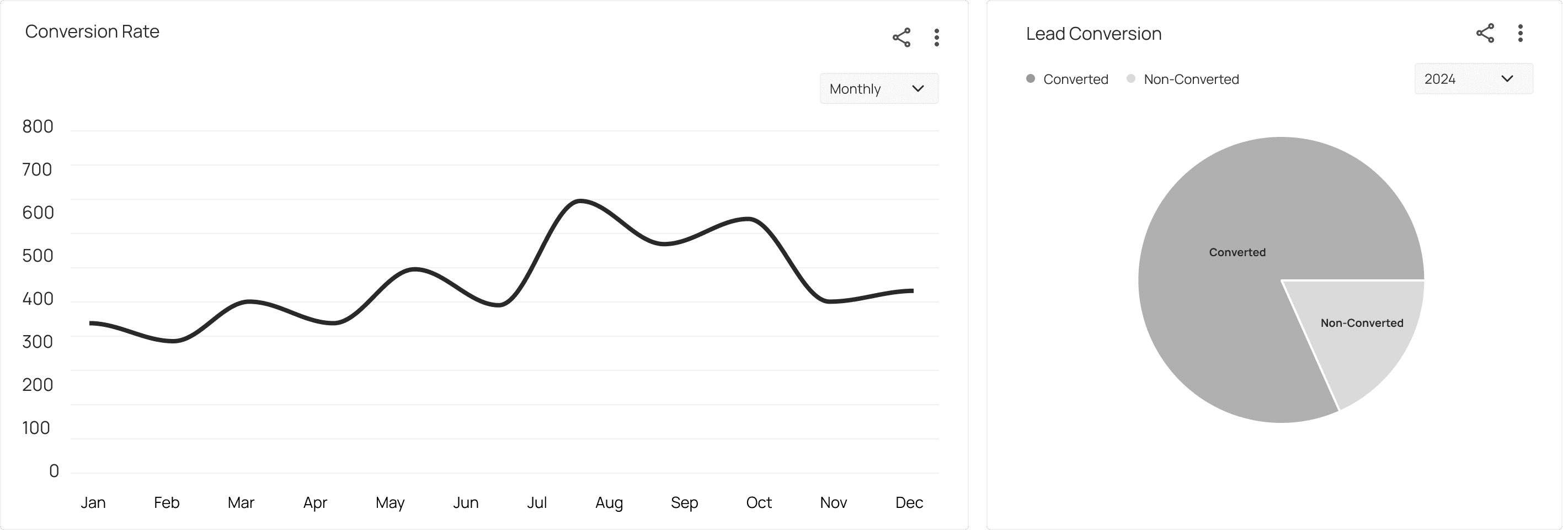
Lead Conversion
Before
Split conversion data into a line chart and a pie chart for better visualization.
After
Integrated all data and combined line and bar charts for clearer visualization.

Color Research
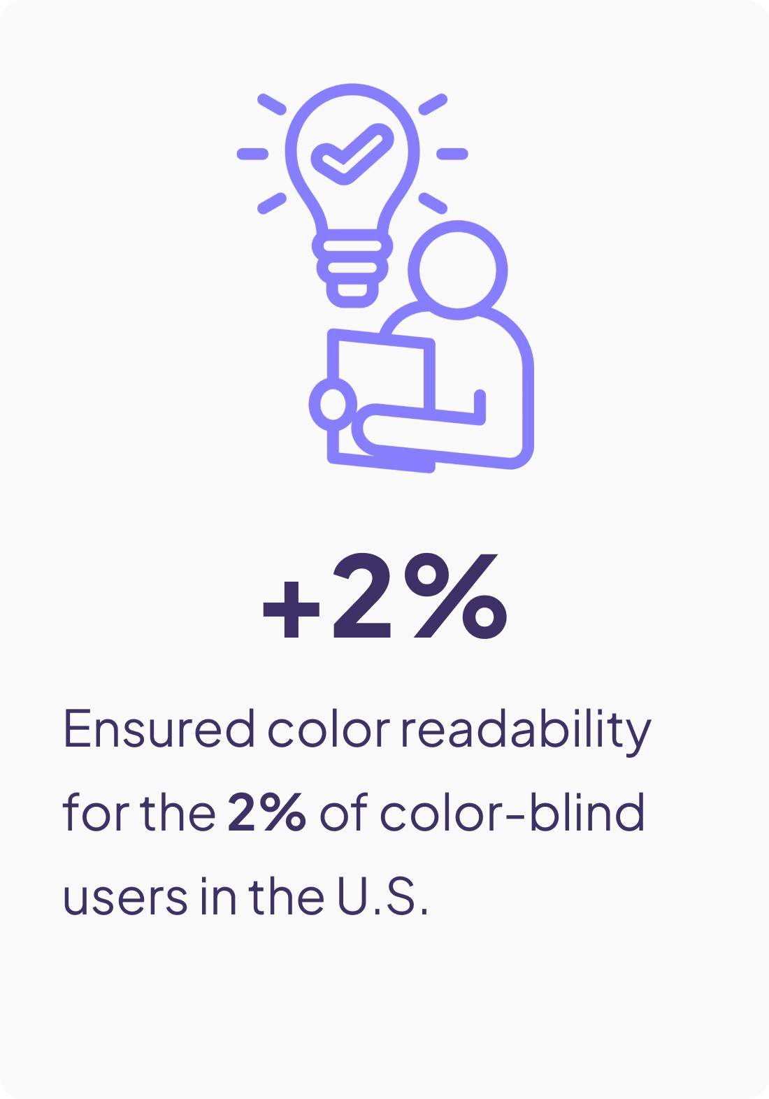
We created four color palettes and conducted Data Vis Color Research. The second palette proved to be the most color-blind-friendly for 2% of users in the U.S., so we chose it.

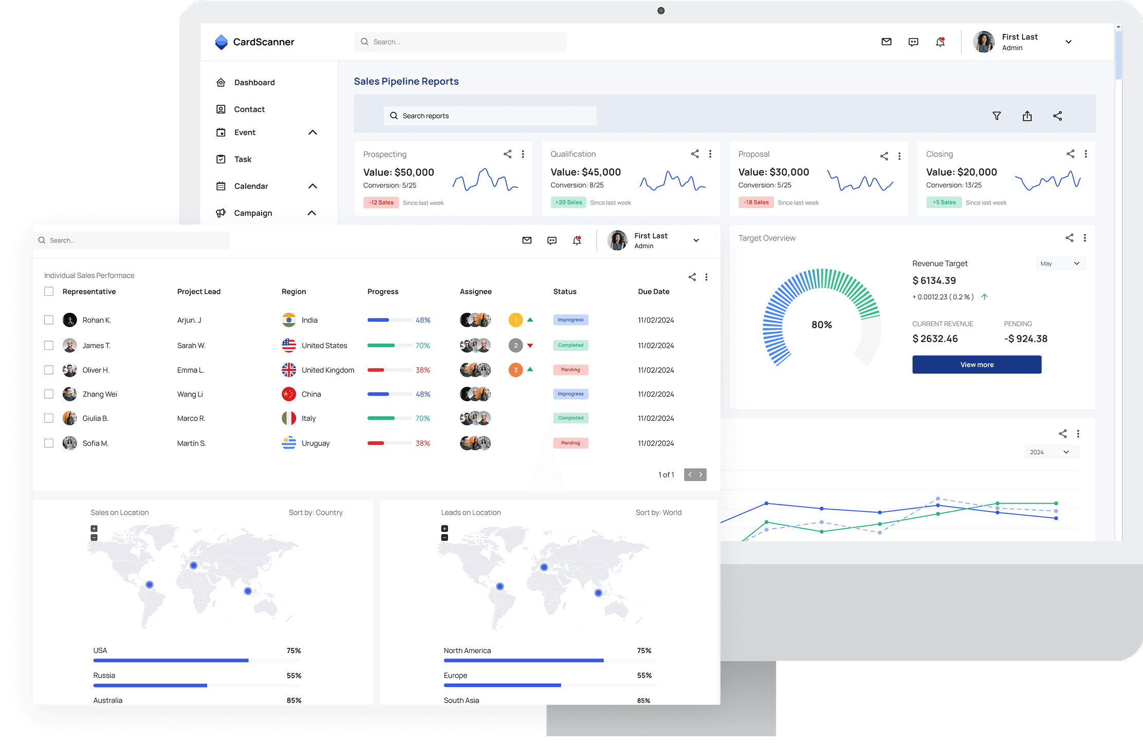
Final Results

TAKEAWAYS
Data Visualization Matters
I realized that choosing the right charts can make complex sales data easier to understand and act on.
Accessibility Improves Usability
learned that a well-designed color scheme not only enhances aesthetics but also ensures inclusivity for all users.
Let’s Connect: cocofan200@gmail.com