
CardScanner
CardScanner helps business manage contact lists by scanning business cards to ensure the efficient and accurate.
Team
Developers
Project Manager
Tool
Figma
After Effect
Tımelıne
9 Weeks
My Contribution
Front-Facing Camera: Implemented for desktop contact scanning with PMs and engineers.
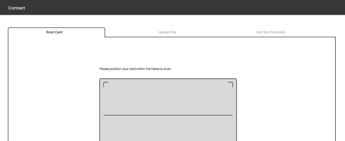
Contact Adding Methods: Designed real-time scanning, image upload, and manual entry.
Final Metrics


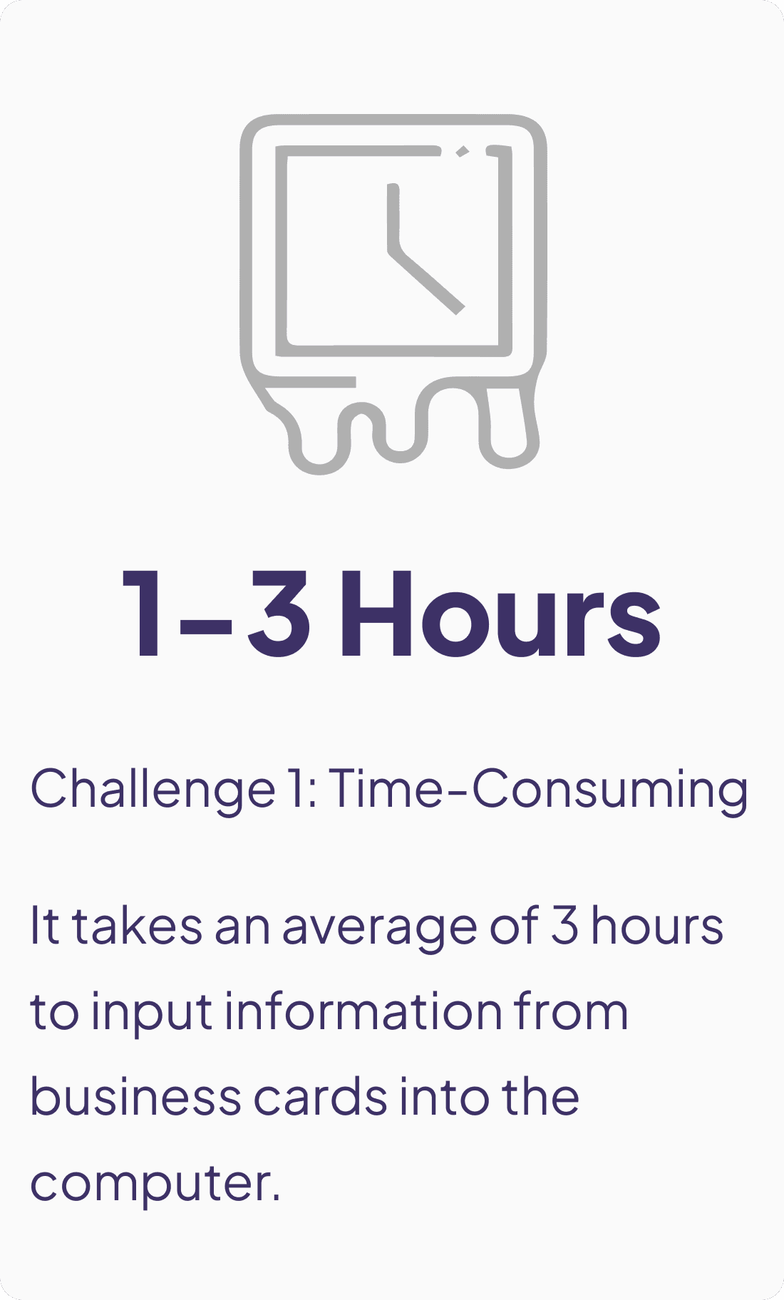
The Problem Space
Current CRM platforms rely on manual input for adding contacts, which is time-consuming and often inaccurate when managing large customer volumes.
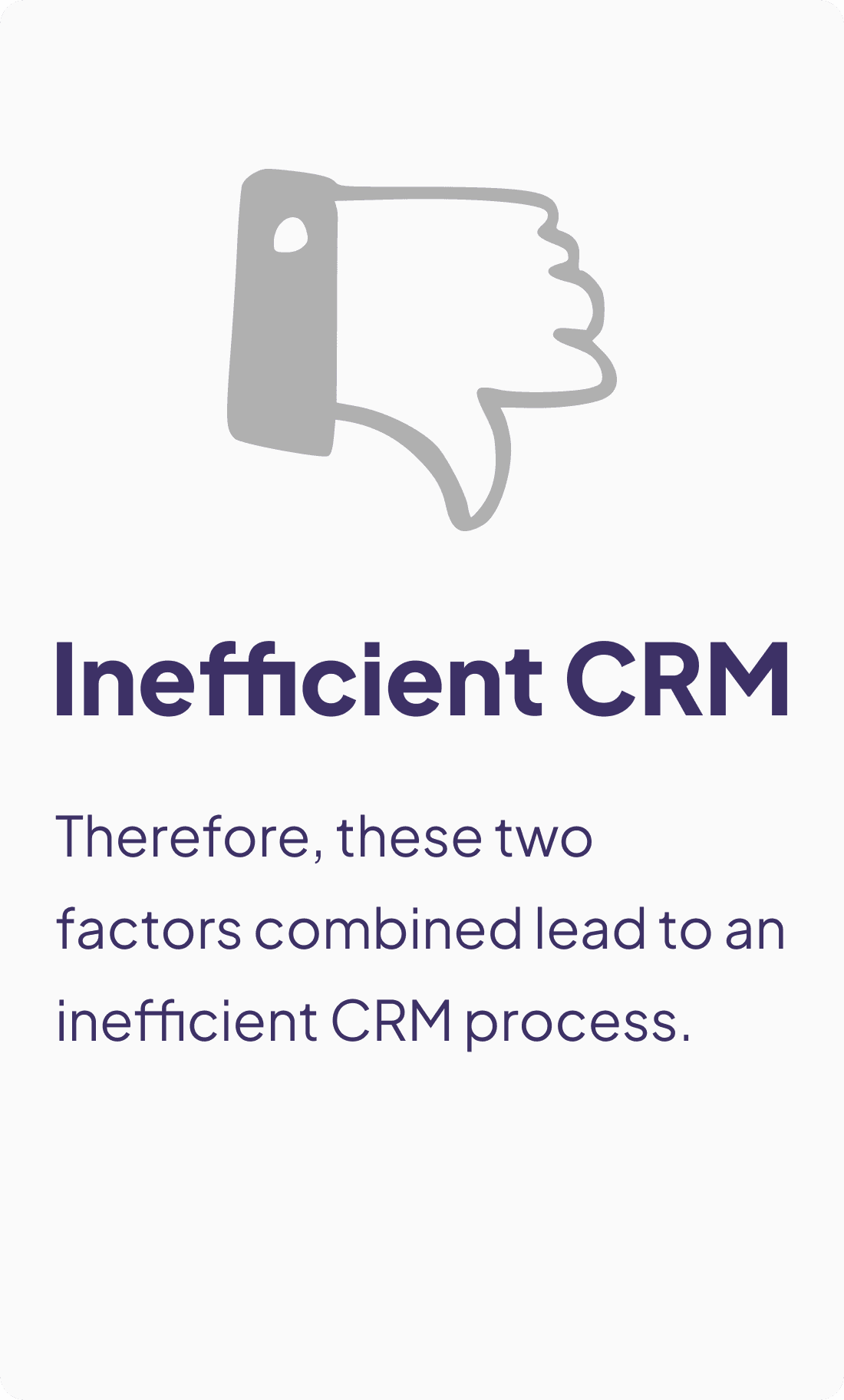
Our Solution
We use scanning to add contacts, enhancing efficiency, and a review page to ensure accuracy.
Overview
CardScanner is a customer relationship management (CRM) platform designed to help businesses manage customer relationships, sales, marketing, services, and other business processes. A crucial and fundamental feature of our platform is Adding Contacts.
Our primary target audience comprises sales representatives, marketing managers, and business development managers.
According to data from our research team, business people in companies, especially during peak summit seasons, can receive up to 50-70 business cards at a time.

Salesforce, Hubspot, Pipedrive, and Zoho are the CRM platforms most businesses use. Here’s how they add contacts:

While most platforms provide the basic information needed to add contacts in a clear, form-based UI, they don't address the core issues users face when managing large volumes of contacts: Time and Accuracy.
My Solutions:
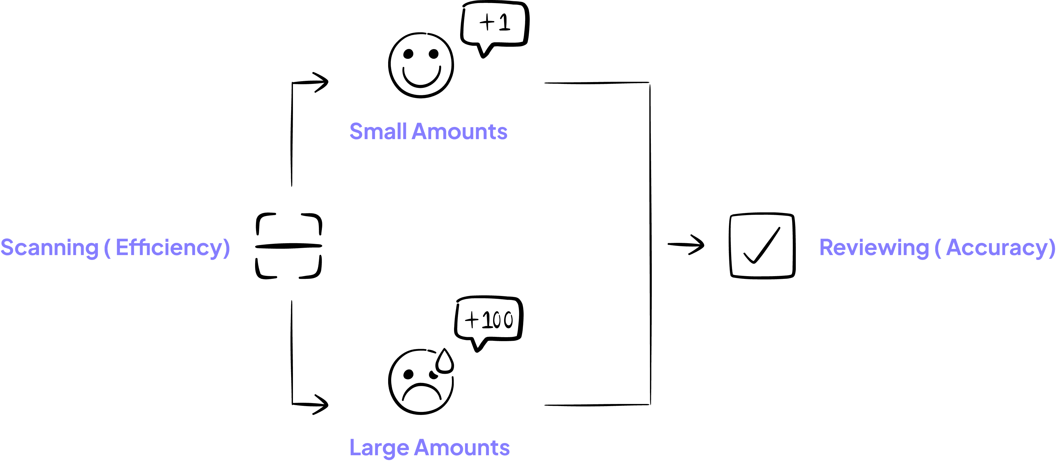
To solve this problem, my first thought was to use the computer's camera to scan the cards. The team agreed that this was indeed an effective approach. The developers noted that when scanning a small number of cards at once, it worked well, but when scanning more than 30 cards at once, errors would occur. So, to ensure accuracy, we decided to add a review page after scanning.
During this process, the team added new requirements of upload files and keep manual input, and I worked closely with them to ensure the technical feasibility.

In the early stages, I experimented with various approaches. Even though some were rejected, these attempts helped me gain a clear understanding of the technical limitations, guiding me toward a more feasible direction.
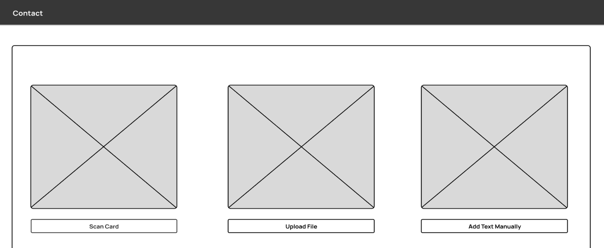
By the mid-design phase, I developed three scanning navigation patterns’ wireframes from the angle of efficiency, focus and clarity that were both feasible and met the requirements.
Efficiency
Clarity
Focus
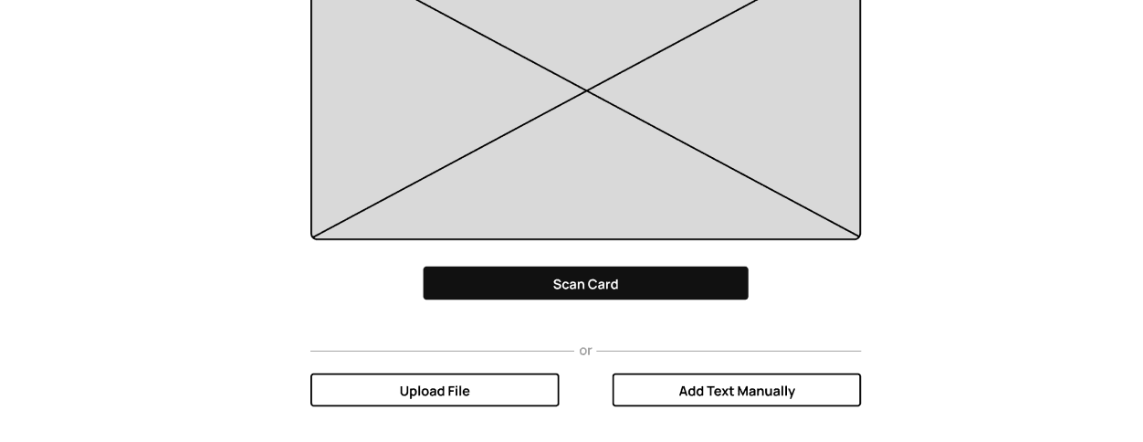
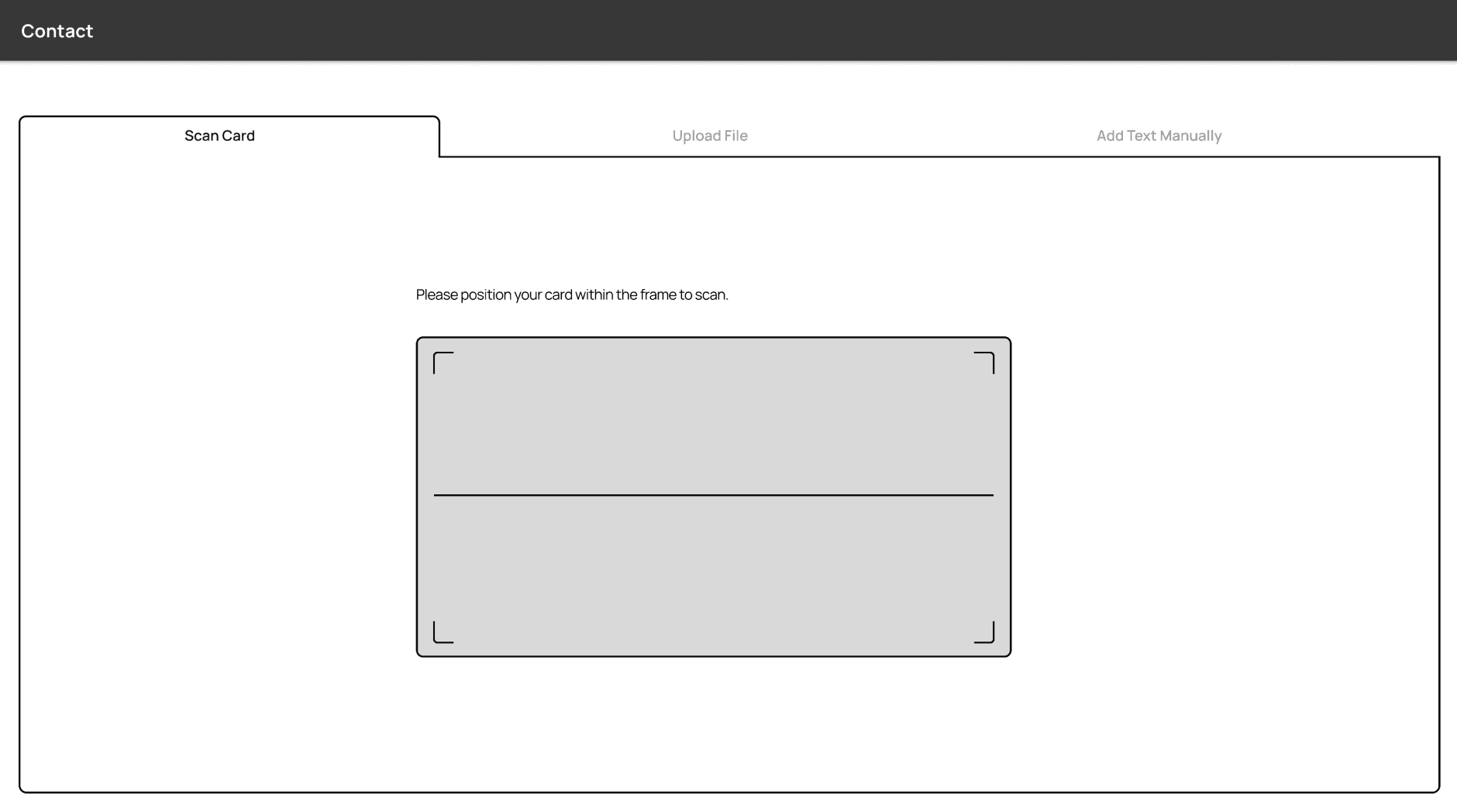
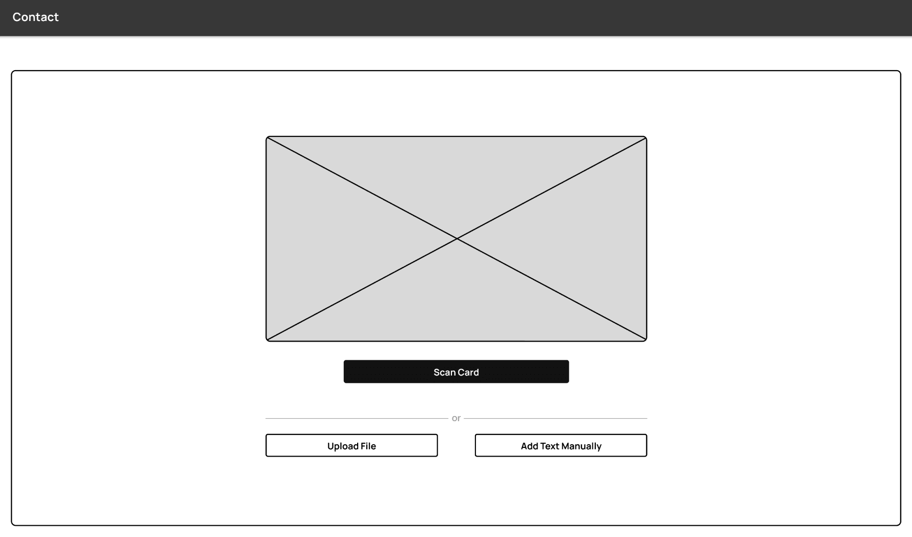
Now, we’re having different opinions. The team preferred the left one, which had tabs with 3 options at the top and the scanning process below. However, I recommended the right design, where we provide three options at the start, guiding the user to focus on one task at a time.
Efficiency
View all options at same time
Save unnecessary steps
Interface is fulfilling
Focus
Show scan card is our preferred choice
After selecting an option, hiding others helps users focus, increasing efficiency. Click back button to choose an option again.
Efficiency
8/10 target audience preferred Team Choice.
B2b interface that supports complex workflows.
Chance options without clicking back button would be more efficient.
The three functions usually is arranged from left to right without occupying the entire tab area.

Before
Too many options on the same screen proved unfeasible.
Additionally, our initial review requirements weren’t fully addressed.

After
Allowing users to selectively or batch save, edit, delete, or rescan cards.
Most importantly, it enables users to review multiple cards at once.
While principles are important, they don’t always apply in every situation. Design isn’t necessarily so black and white.
Although my idea was not ultimately adopted, this experience taught me how to use my knowledge as evidence to demonstrate its benefits in team discussions.
It also gave me new insights into B2B products. I realized the importance of truly considering my users' situations and the business needs.
Final Results

Efficiency: Multi-card scanning and delete: quickly manage business cards.
Given the large number of contacts, we offer multi-card scanning, displayed like an album.
You can easily delete unsatisfactory or unnecessary scans with the undo button.

Efficiency: Supports Excel/CSV file uploads for bulk contact entry.
We support image and file uploads to help you manage a large number of contacts. You can edit contact information in the file review interface.
Accuracy: Versatile review interface for easy edits.
You can save individual cards, select specific cards to save, or save all at once.
Not satisfied? Rescan the unsatisfactory cards. You can also edit inaccurate information or delete cards as needed.


Clean UI: Manual input option is retained.
We retained the traditional manual input method for adding contacts, but also offer the ability to add multiple contacts at once by clicking the plus sign for the next card. This ensures your efficiency.
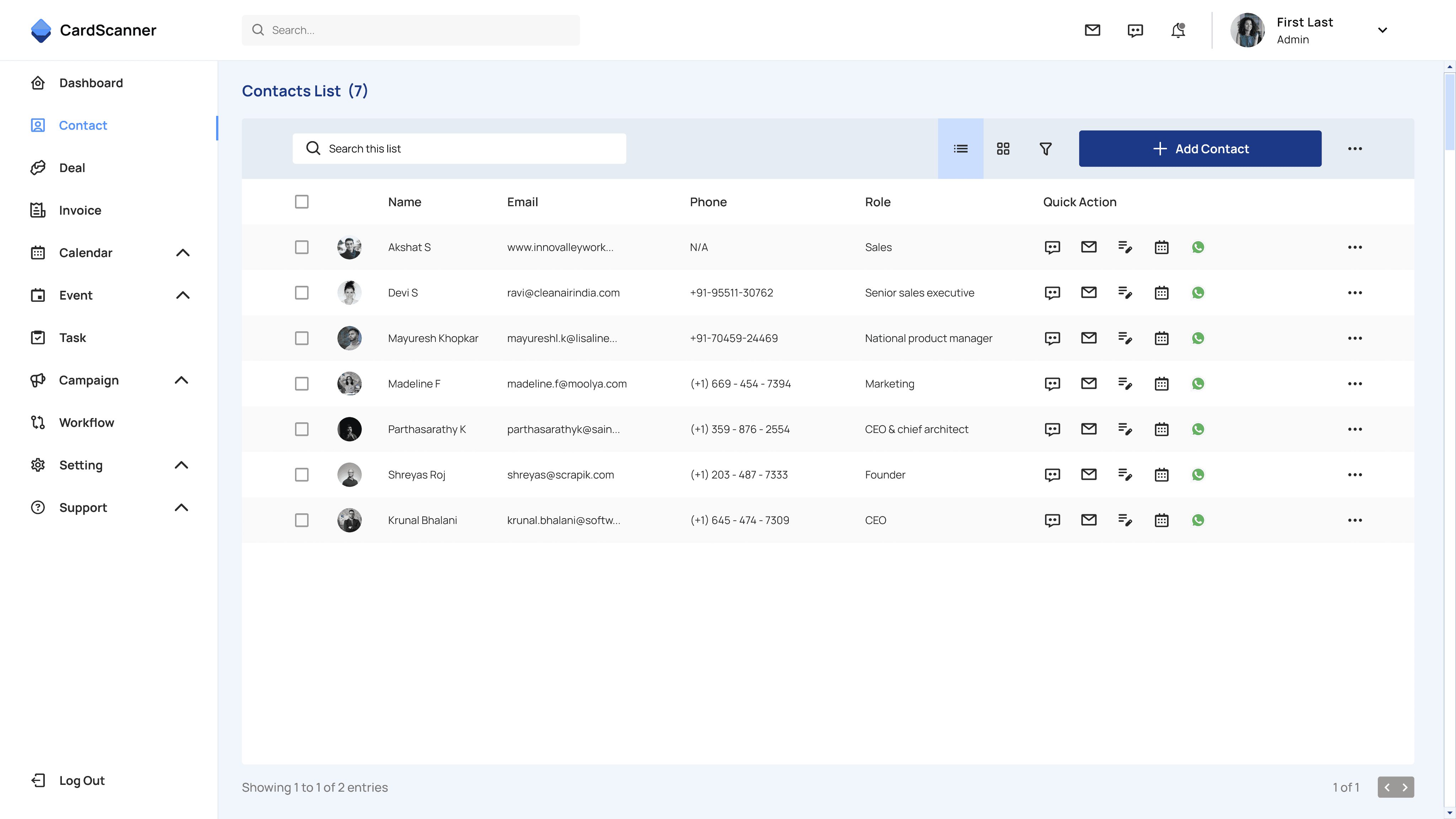
Clean UI: A clear contact management panel.
First-time users start with the scan-to-add page if no contacts exist. Existing users see the contact panel first and can click +Add Contact to choose a method.
Quick Actions allow fast interaction with contacts.
Takeaways
Cross-Team Collaboration & Communication
In my collaboration with team. I recognize the importance of providing evidence and reasoning when discussing design aspects. Maintaining a professional and polite attitude, I engage in discussions to find the best solutions together. Designers, PMs, and developers must work as a unified team to create successful products.
Adapting to Different Product Philosophies
In different products, learning and quickly adapting to various philosophies is crucial. B2B products focus more on efficiency and require design considerations for multitasking, differentiating them from B2C products.
Not Fearing Seemingly Foolish Ideas
In the initial stages of brainstorming, where some ideas may seem foolish, it's important to think boldly. Rejection is normal, and every dismissed idea holds potential for success.
Let’s Connect: cocofan200@gmail.com